BOOKSHELF CHANGEUP
We recently had some pretty fantastic snow days here in Alabama, and I actually was able to do some productive things while we were out of school. It doesn’t matter that the productivity didn’t actually happen until Saturday when the snow was mostly melted. Hey, I thoroughly enjoyed my SNOW days by staying warm under the covers rewatching Big Little Lies. They’re winning all these awards, and I felt like an eight episode show wasn’t too much to binge in a few days.
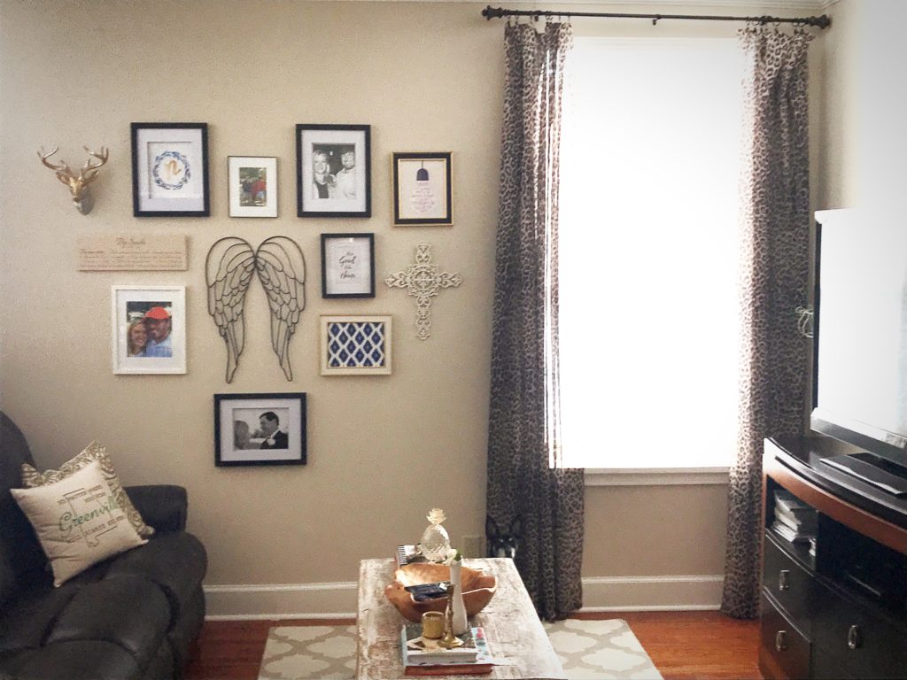
But Saturday came and I was feeling the creative bug, so I took my gallery wall apart. 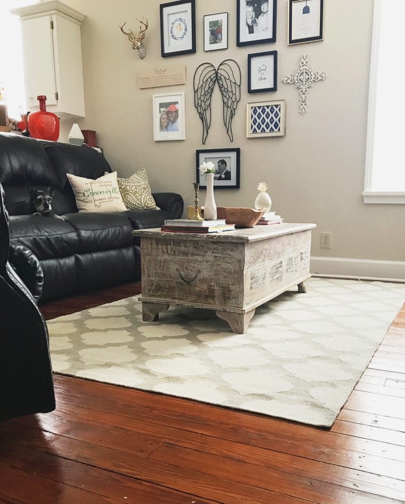 And then promptly put it right back together because I don’t have anything else I’d like to put in its place. I have a lot of things in my cart at Minted but I don’t have a lot of money in my bank account to pay for all those pretty prints. Story of my life.
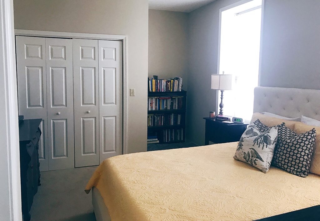
So then I walked to my bedroom, looked around and realized the drapes in my cart at Ballard don’t really go along with my bank account either. Sooooo…I decided to rearrange the books on the bookshelf. I knew I wanted a more streamlined look somehow. I didn’t want the messy look of all the randomly placed books. I’ve been craving simplicity in my decor, and the mismatched spines on the bookshelf didn’t fit that for me.
Here’s what it looked like before. ![]() This was about a year ago in March. At the top are all of my cookbooks and a few children’s storybooks I’ve collected. You can see there’s no real rhyme or reason to the way I shelved the books. It’s not necessary for there to be a rhyme or reason to shelving books, but like I said, the creative bug had bitten me, so I went for it.
This was about a year ago in March. At the top are all of my cookbooks and a few children’s storybooks I’ve collected. You can see there’s no real rhyme or reason to the way I shelved the books. It’s not necessary for there to be a rhyme or reason to shelving books, but like I said, the creative bug had bitten me, so I went for it.
Here’s what it looks like now.![]()
I decided to shelve the books by the color of their spines. In keeping with the need for simplicity I started with white and black and just kept going. I know I didn’t follow Roy G. Biv, but it works for me.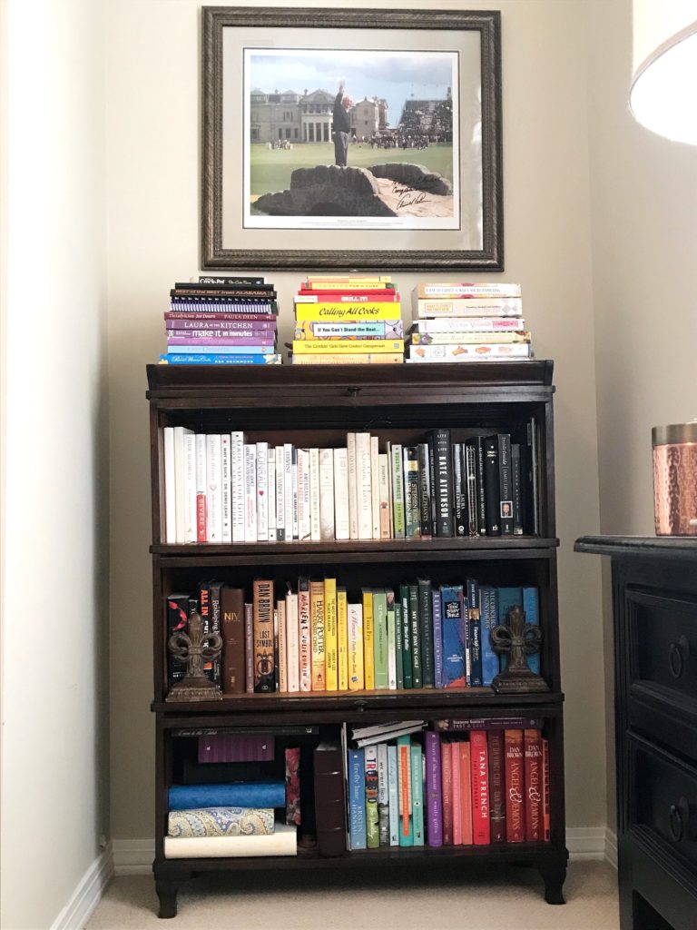
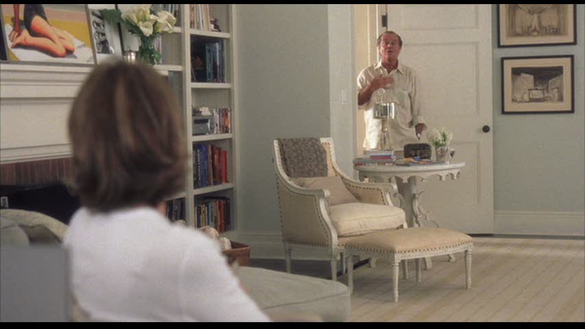
The cookbooks on top got switched to stacks instead of the unlevel, upright position they were in. There’s a lot more yellow in those cookbooks than I would like, but since I don’t have Erica Berry’s kitchen from Something’s Gotta Give (that post here) and nowhere to put my cookbooks in my kitchen, this will do. I like it much better already.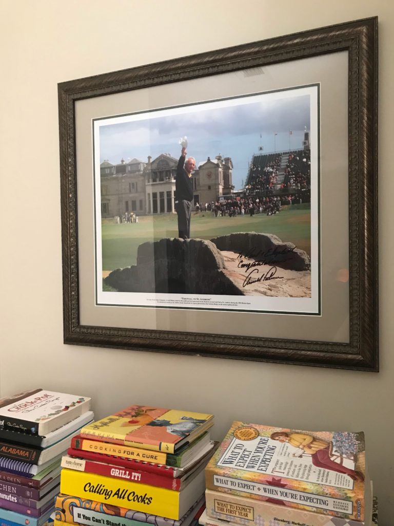
I also decided to hang a picture over the bookshelf. Paul went to school with a guy that works at one of Arnold Palmer’s golf courses, Bay Hill. For a wedding gift, he got Mr. Palmer to sign a photo for us. But it wasn’t just a photo, it was a large print that he personalized for us. It was so special to Paul, and we had it framed so that we can enjoy it always. (Thanks, Josh!) I think it looks lovely hanging above the bookshelf, and I don’t know why it took me so long to decide it belonged there.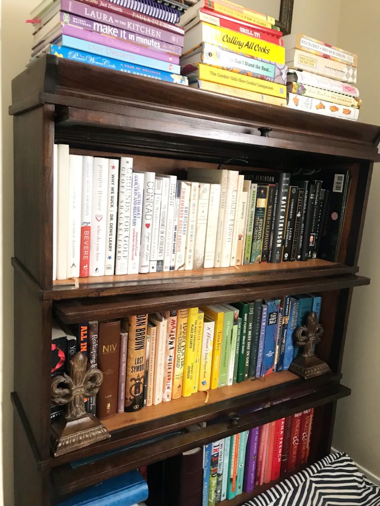
I know this wasn’t a drastic change, but I love when something small makes a big impact. I hope that you’ve gotten some ideas on how to update your bookshelves or inspired you to hang a fun photo. Do you arrange your books in any certain way? Do you hoard books like I do? Do you have any special photos, posters, and/or works of art? Let me know in the comments.


 I’m a sucker for wallpaper. I know that many people, my parents included, have probably sworn off wallpaper after scraping some from the 80s or 90s off walls and ceilings. Yes, ceilings. There was pineapple wallpaper on the ceiling of my parents’ kitchen when we first moved into that house. Nowadays we have things like removable wallpaper, so if we want to try a bold pattern on the walls, we won’t feel so bad about taking it down in a few years when the trend is over. I very seriously thought about doing wallpaper in our
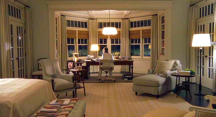
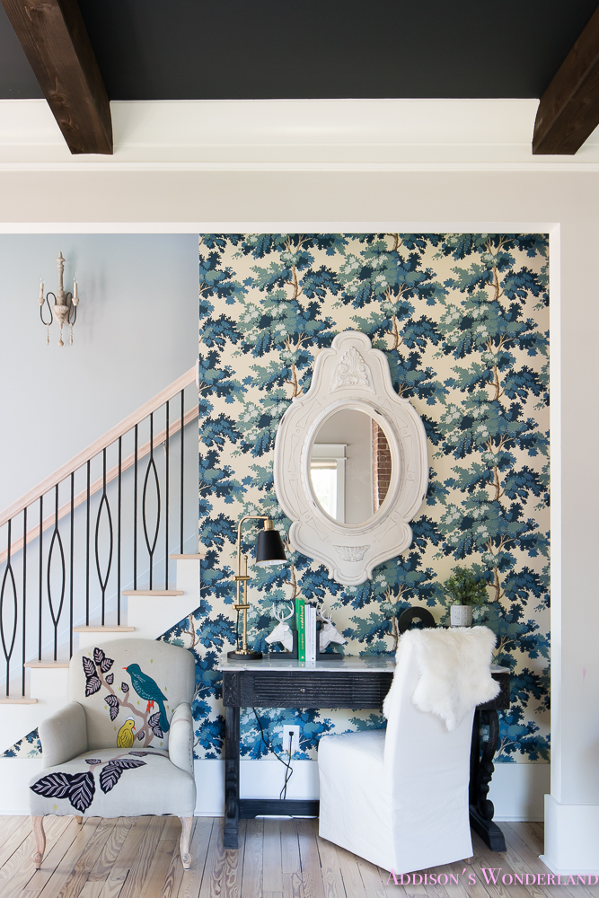
 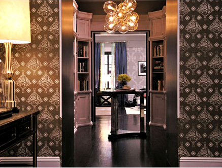 Okay, back to Casa de Preston. I love a foyer with a table in the middle. I guess that room looks as if it’s technically serving as a mini library, but the table right in the center is one of my favorite ways to style a space like that. It’s the perfect excuse for fresh flowers. And that light fixture is just perfection. I am loving interesting light fixtures more and more lately. This bubbly one is very chic.
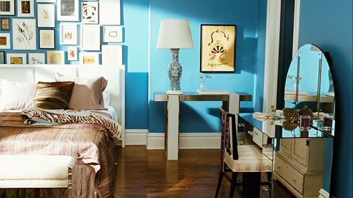
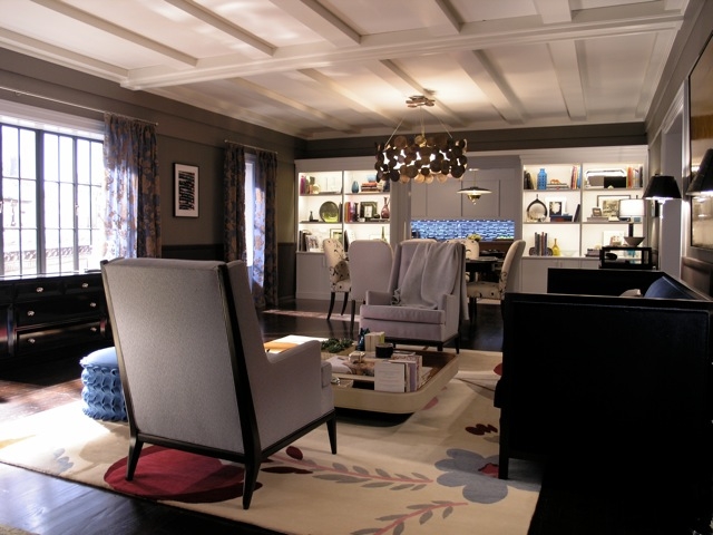 Moving into the living room brings that beautiful ceiling. I love architectural details. That’s what really gives a home it’s character. Another thing I love about this space (because it feels like it’s breaking the “rules” a little bit) is that light fixture. I can’t quite figure out if it’s wooden medallions or bronze ones or maybe brass? Anyway, I think it’s very interesting, but I also like that it’s not centered over the table or the center of the living room. It’s just right in between the two spaces looking pretty.
 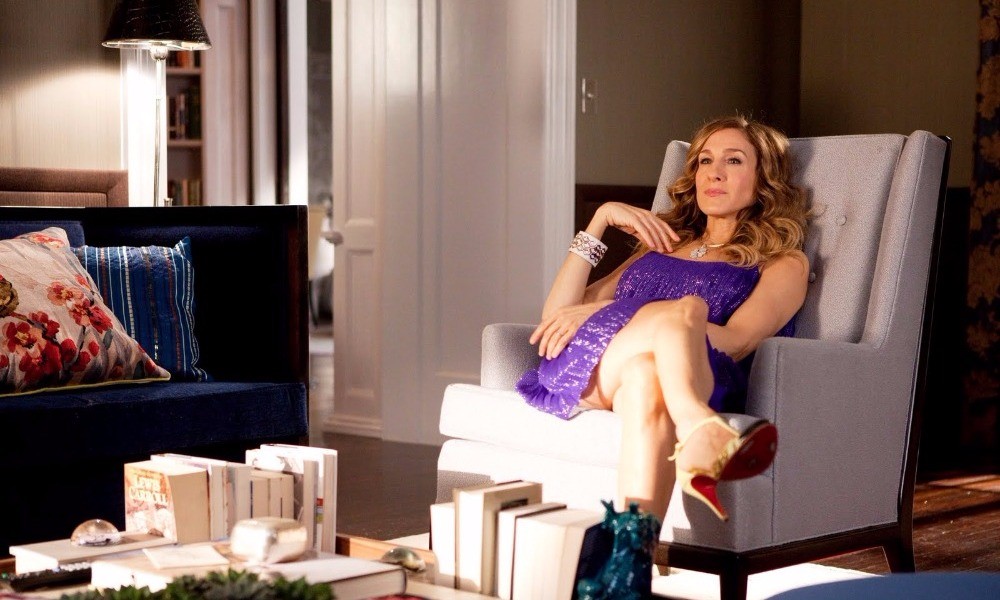 What a great idea to store your books upright on the coffee table? I never would have thought to do this. See-I’m always learning things. And an added bonus to doing this is the great bookends you get to use.
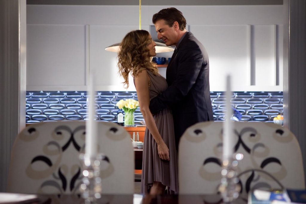
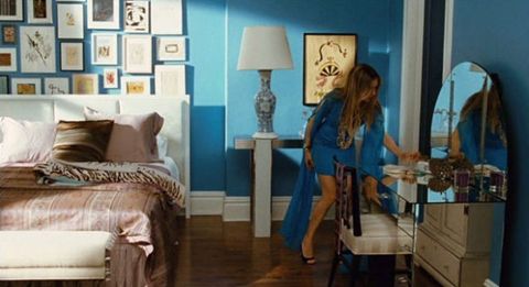
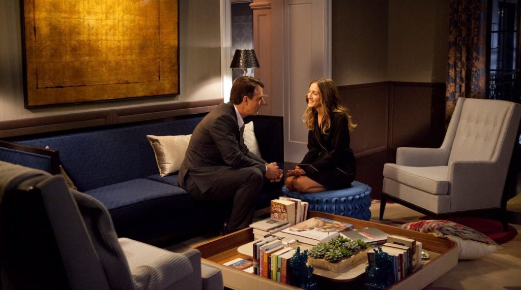 I notice that Carrie must really like the color blue. Remember the last apartment was all bright and, I feel like, quintessentially Single Carrie. But as she and Big got married and have merged their lives together into one space, she didn’t forget her favorite color. (Just wait for the kitchen backsplash.) She just used it in different shades. The whole apartment is covered in different shades of blue. In the picture above there’s the navy couch, the cornflower blue ottoman, and the teal Foo Dog bookends.
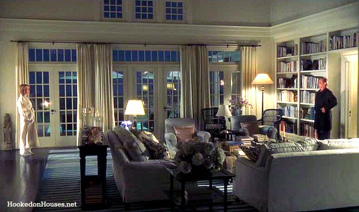
 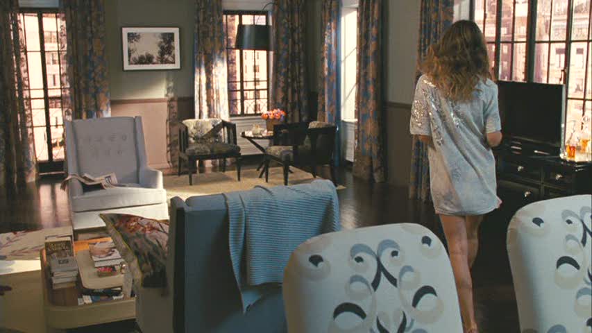 And then those drapes. They cover the room in yet another shade of blue, and it all just works. Here’s another lesson I’ve learned in home decor: It’s okay to mix patterns and prints…as long as you have a color that brings them together to help the space make sense. Nearly every piece in this living and dining space is a neutral or has some shade of blue.
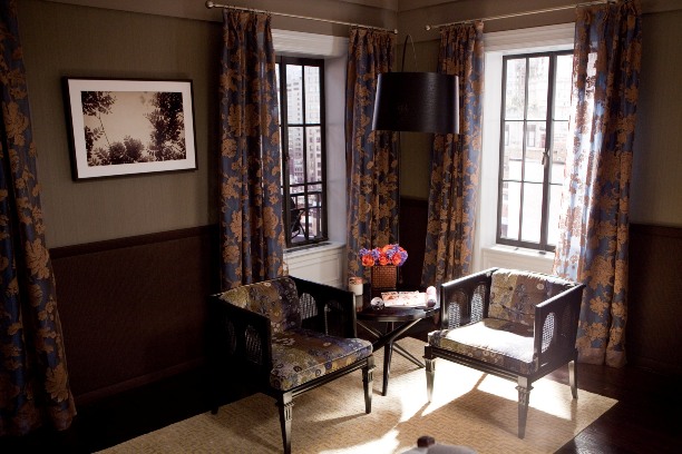 I’m digging the open floor plan and really loving those built-ins. The lights inside each shelf that illuminates them from within is so pretty and really showcases what you’ve got on the shelves. We also get a glimpse of that wild kitchen. Hello, Carrie’s apartment shade of blue. 🙂
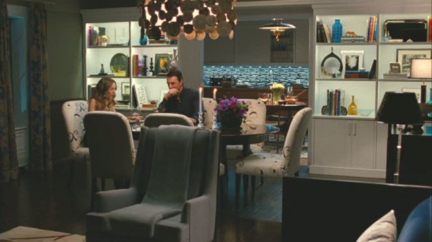 I really love these chairs. The shape, the pattern, everything. And see the light? Is it wood? Is it brass? Is it bronze? Whatever it is, it’s pretty.
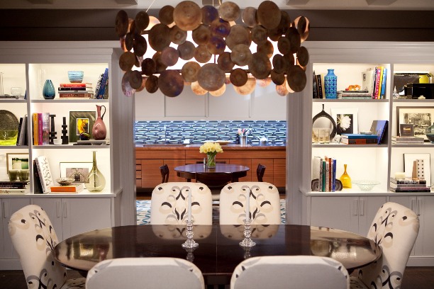
 The kitchen almost feels a little retro to me. Maybe it’s the tile backsplash (feels a little sixties mod) or the light (a little bit 50s). Maybe it’s the color of the wood on the lower cabinets that reminds me of some of the movies made/set in the 70s. Or the style of the table and chairs. Or the lack of hardware on any of the cupboards. I do love the big rug in the middle of the kitchen. It’s so unexpected. Again, breaking those rules.
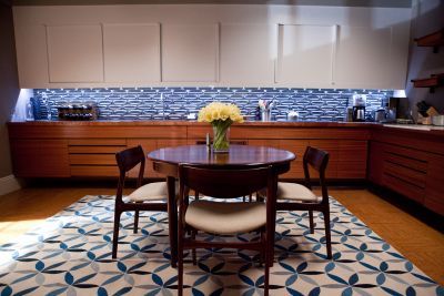 The open shelving is really nice, and it appears the fridge is just to the right of it. I also really love the floors.
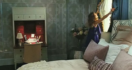
  When I first saw this movie and they finally arrived home from Stanford’s and Anthony’s wedding, this was the room that had my heart all aflutter. The wallpaper was speaking my language and then I saw it mixed with the patterned headboard and those inky blue drapes with the gold fringe trim. Yes! Yes! Yes!
  Another master with a sitting area. I fell in love with the idea when I was putting together the
 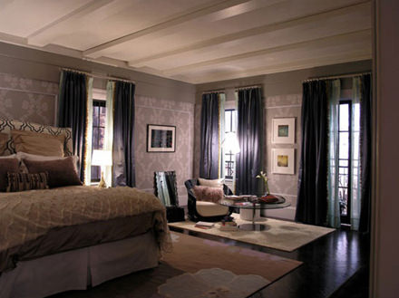 Also, the drapes on every window a real statement. They are so beautiful. Window treatments are like the perfect piece of jewelry to a room. It just adds a finishing touch that nothing else could accomplish. My mom always says curtains makes a room feel “homey”. I agree. I think they are inviting, and I think I want to plop right there in the seat by the window and have a cup of coffee and read a fashion magazine as Carrie would.
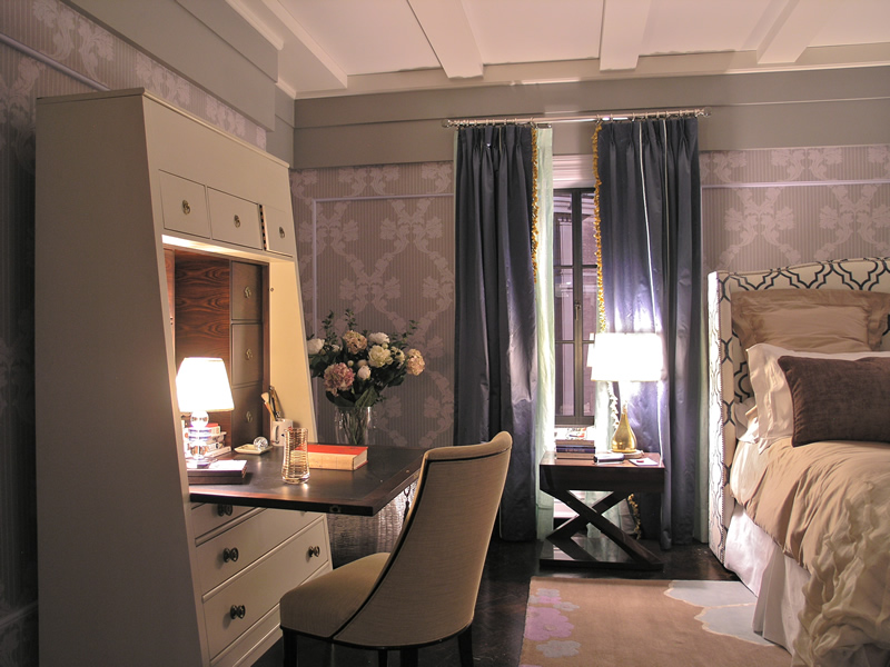
 Well we’ve come to the end. Just like the last
 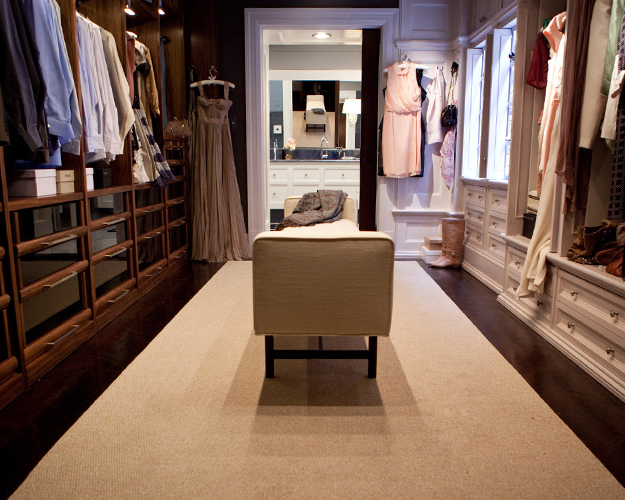 Thanks for coming back to Movie Set Monday. Same time, same place next week, right?
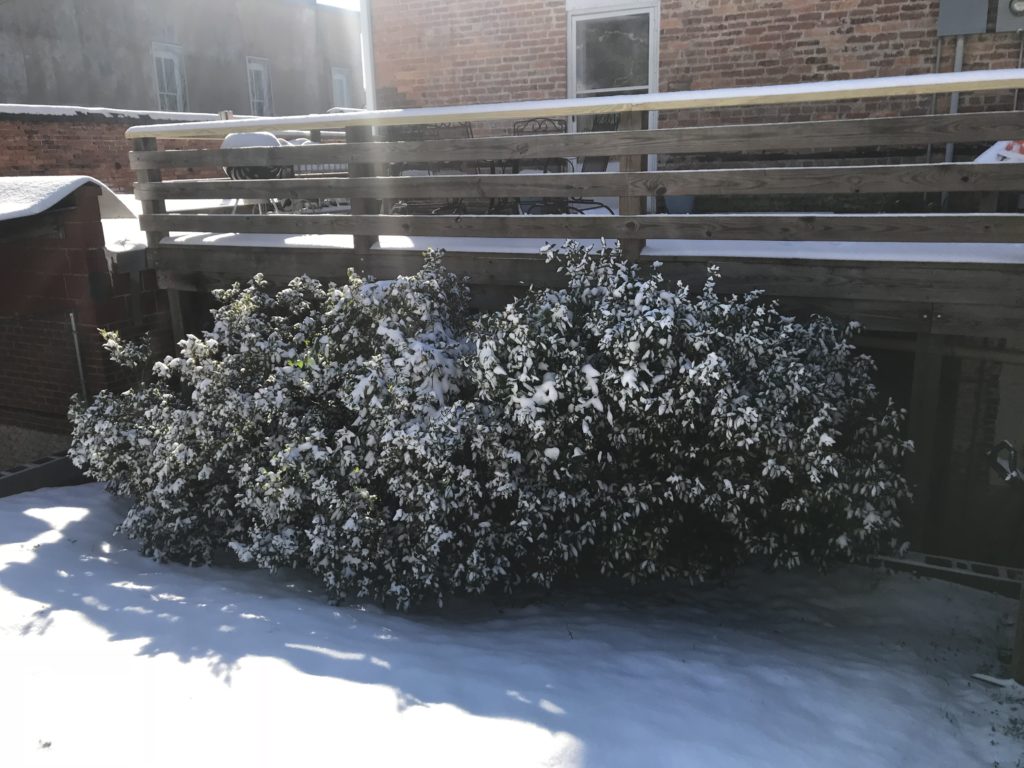
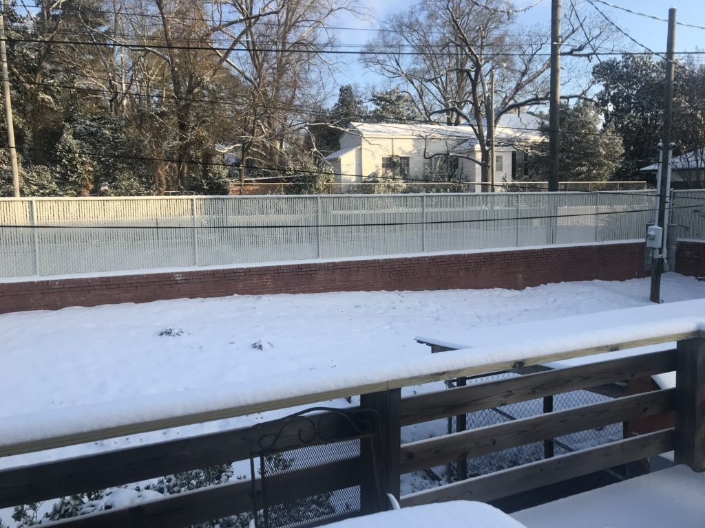
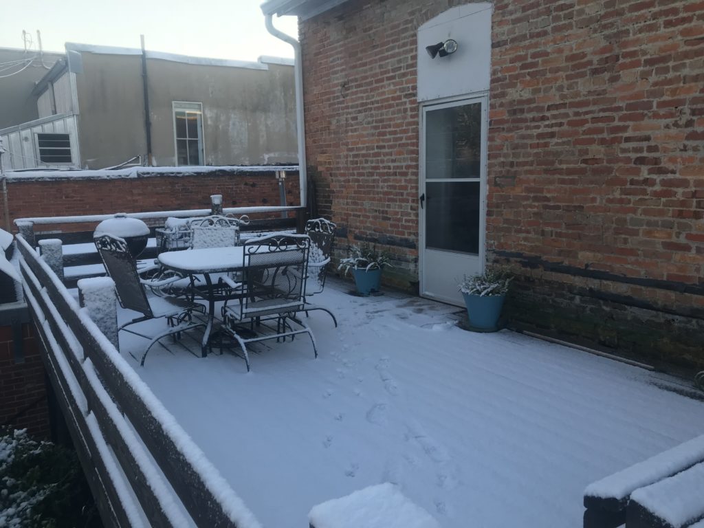
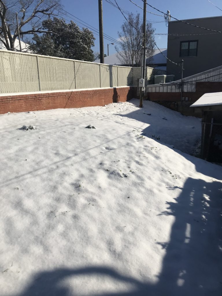 Our backyard is basically the back of downtown retail space, so it’s not exactly picturesque, but anything covered in snow is beautiful to me.


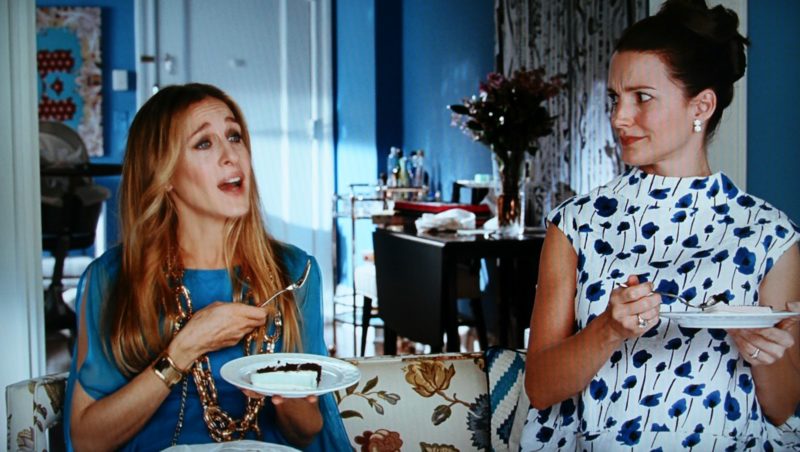
 And how smart was it that as Carrie started to actually feel like herself again that her outfit matched her new apartment. I loved that tiny detail. Everything went from dark and depressed to bright and cheerful. It was a lovely moment in the movie. (Just so y’all know, I’m rolling my eyes at myself over here. It’s just that I’ve seen this movie and the TV show so.many.times. I have practically studied the decor and outfits of every episode and movie, so I’m just a big ol’ SATC nerd. And though I may be rolling my eyes, I’m not sorry I know so much about it. AND I could put names of some of you right here that have watched it just as many times as I have. Sometimes even WITH me!) 🙂
 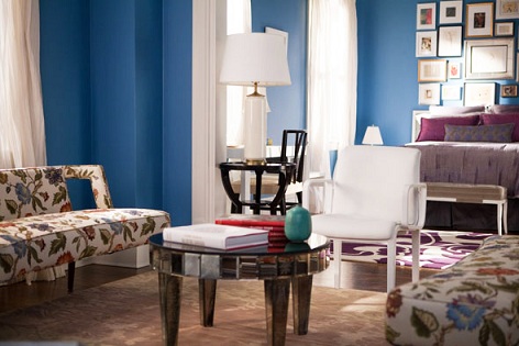 The color and pattern mixing are just right. And I love all of the white window treatments and trim and still more white accents here and there throughout the apartment. I think it calms down all that bright blue so that it’s just right and not too much.
 One of my favorite things is her entryway. I really liked the L-O-V-E wall decal. It was (here comes the nerd part again) such a perfect, full circle moment for Carrie given everything she’d been through with Big. She still believed in Love because she, like me, knows that Love does conquer all when it’s all said and done.
 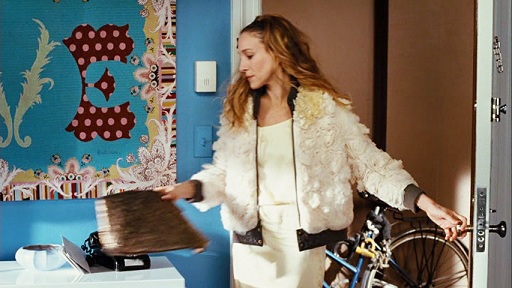 Also still obsessed with that bomber jacket. ↑
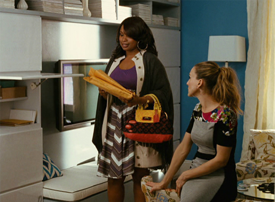 The storage around her TV was another design element I loved about this apartment. It was so simple and sleek and functional. How perfect is that for when you have company coming over unexpectedly? I’d literally stuff everything in there if I had a messy house before guests arrived.
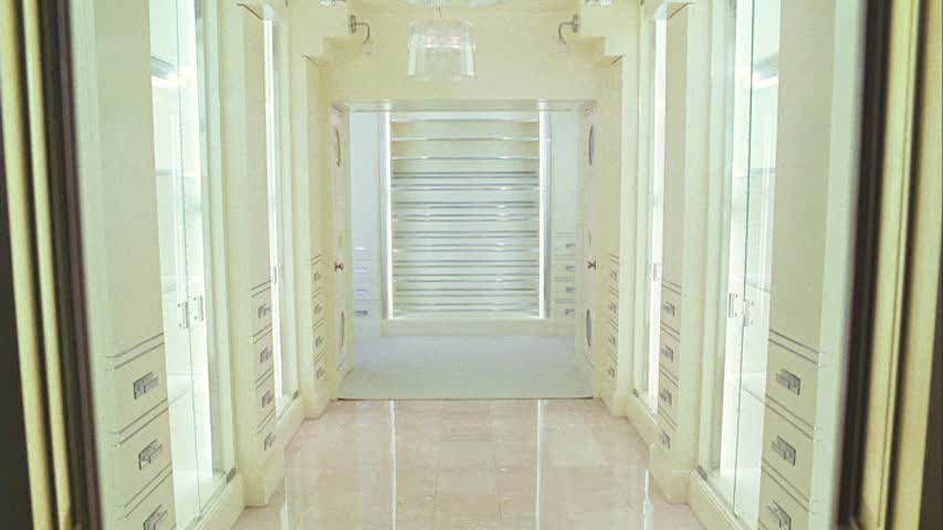
 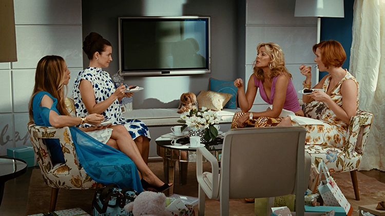 Can’t end this post without a little closet love. This is a photo from the movie. I love the pendants and the runner. And displaying the clothes is the perfect “art” for this space. Carrie always had unique outfits, so hanging them outward was a great way to show them off. I imagine that she liked to switch them out so she could enjoy all of her beautiful clothes.
 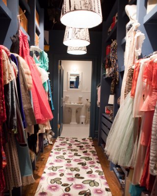 And who can forget this moment?
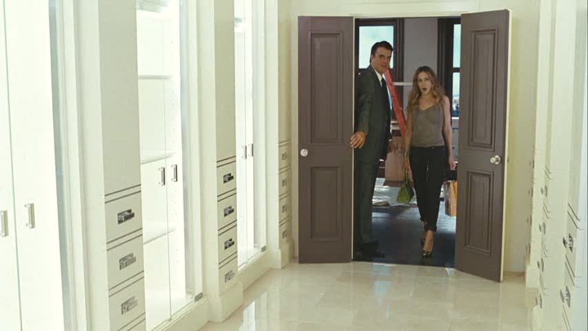
 Yep. I think we’ll end on this good note. Hope y’all enjoyed the walk around Carrie’s apartment. Come back next Monday for another movie set. Have a great week, y’all!
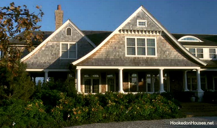 Erica’s house is in the Hamptons, and how positively perfect is this home? I love the color and the shingles, the giant porch and all those windows. It’s so beautiful on the outside, but the inside is my favorite.
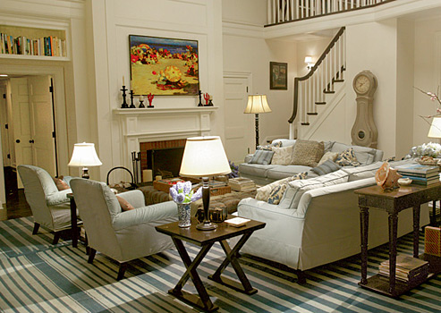

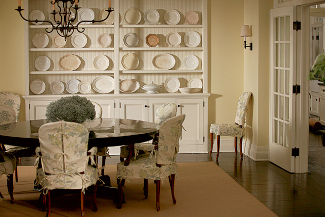
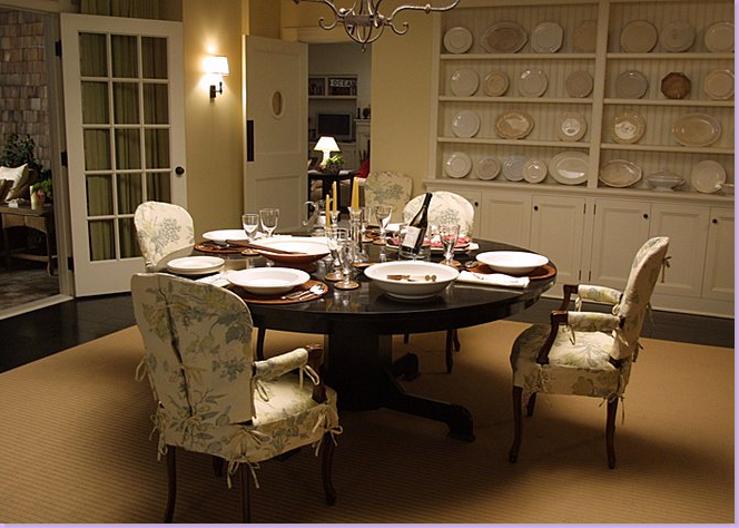 More French doors and more windows. I love interior French doors. I think they add so much character. And what a great way to add privacy but still let natural light be able to bounce around the house. And that beadboard on the built-in is a perfect coastal design touch.
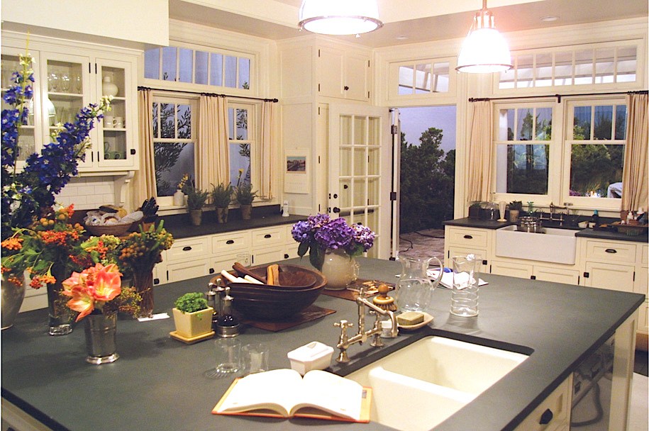
 Yes, Yes, Yes. Everything about this kitchen is right up my alley. I love a white kitchen. And with black and white being my favorite color combination, it’s no surprise that I love the black countertops and hardware. And more windows…there’s just never enough in my opinion. I think a bright kitchen in the mornings is delightful. The kitchen in our apartment is full of natural light every morning, and I love that. That island is what dreams are made of. Look at all the storage and space. I’d love for my cookbooks to actually live in the kitchen like they do here.